Designing packaging that brings awareness, connection, and clarity to Uncle Giuseppe’s Marketplace products.
Packaging with Purpose.
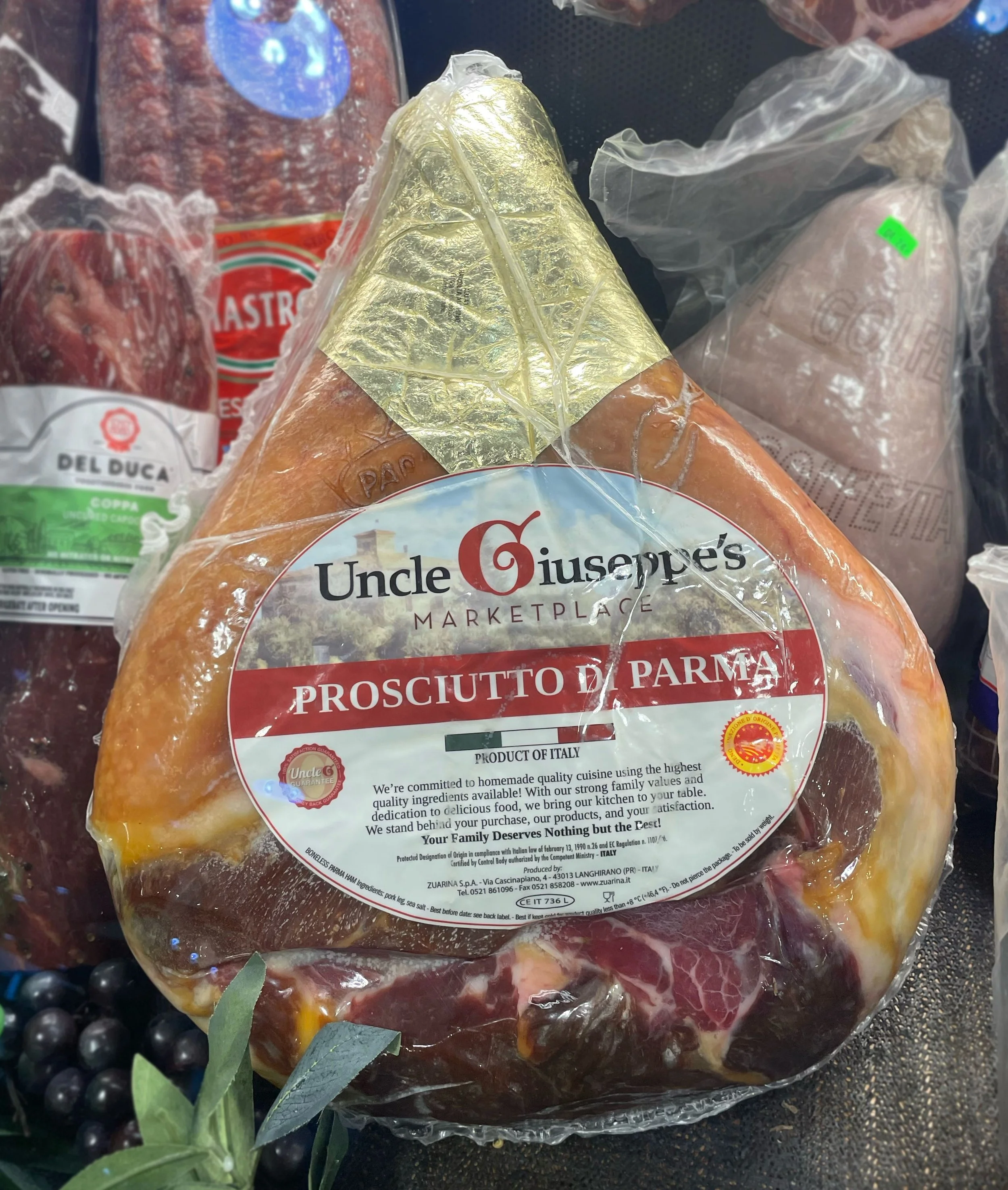
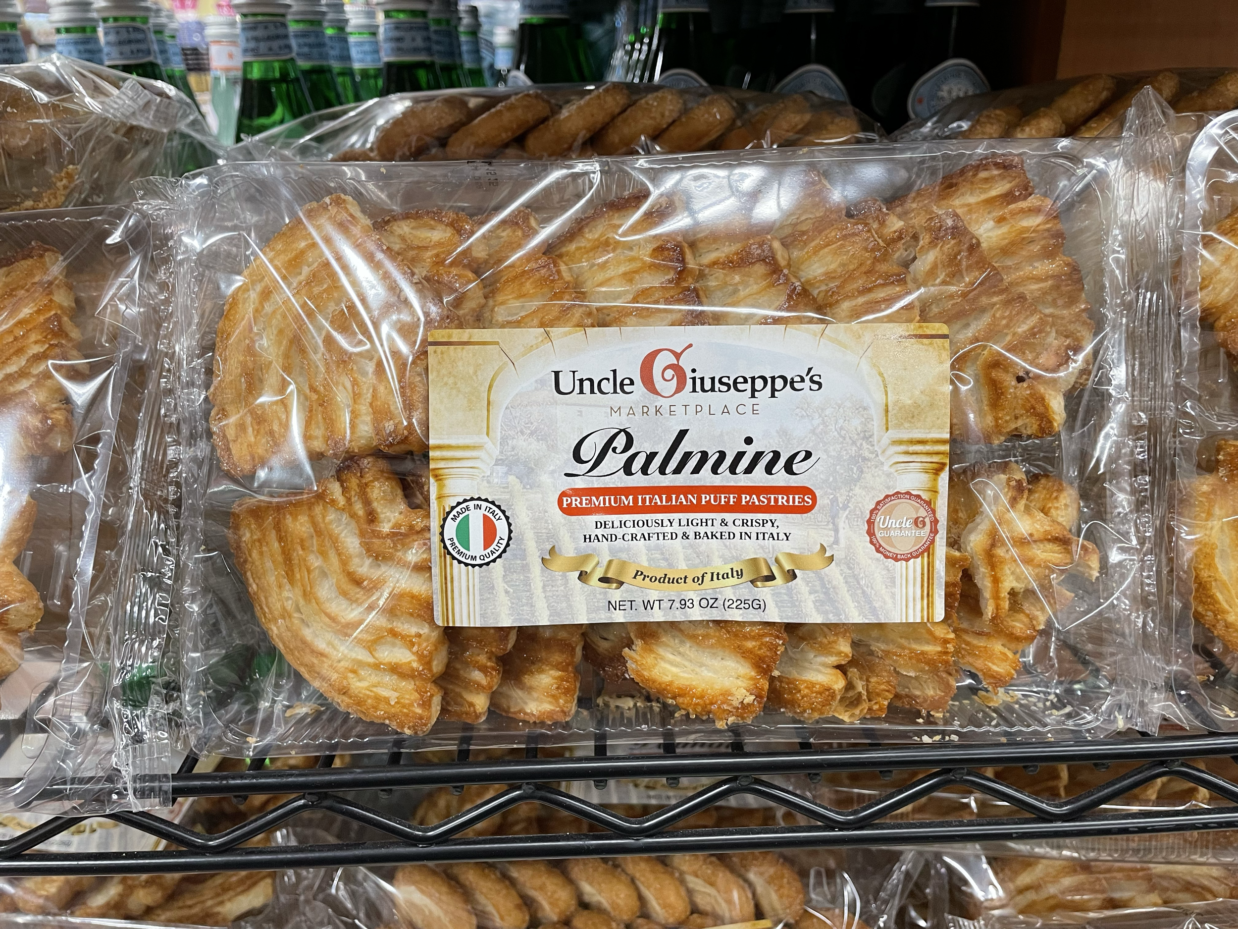
Label Design Features
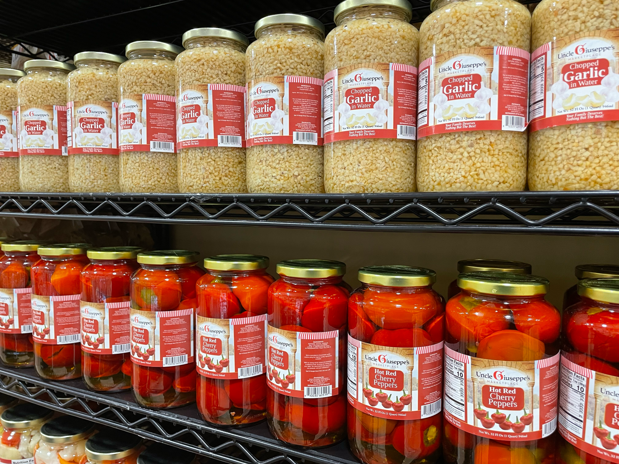
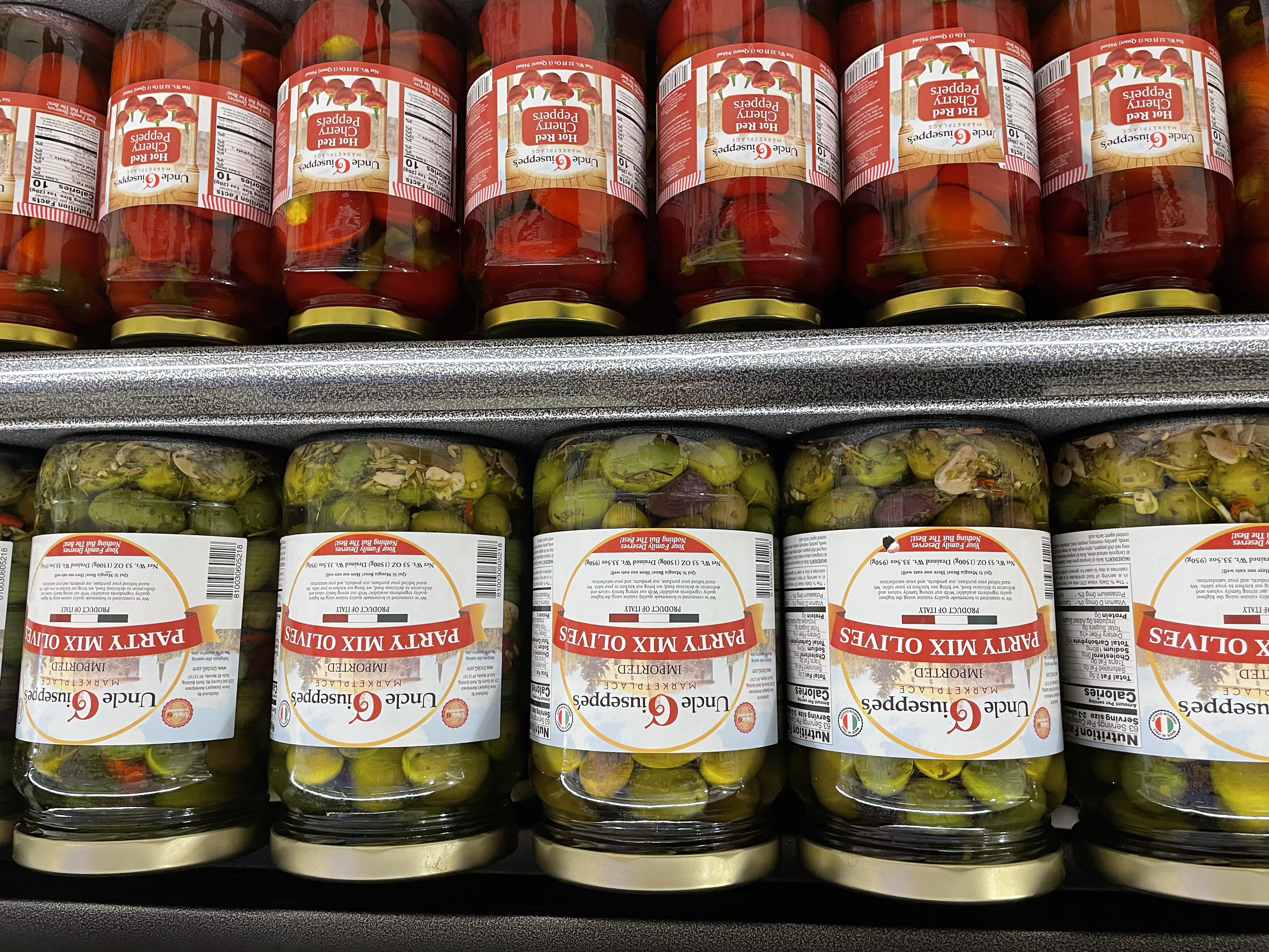
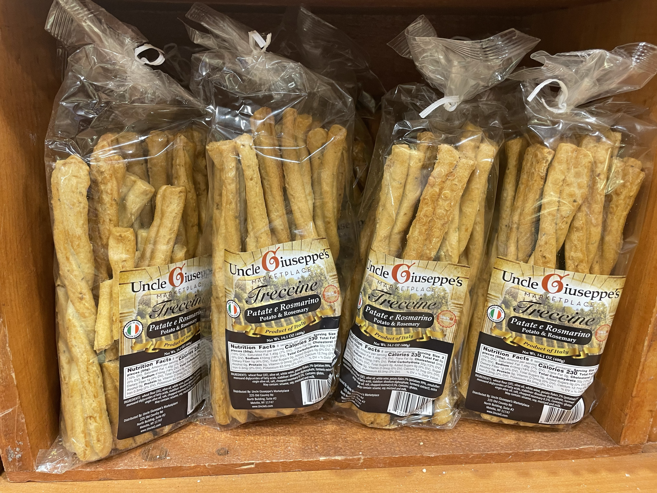
Italian Heritage & Authenticity: Designed a packaging label featuring an Italian villa behind the logo, communicating homemade quality while ensuring full compliance with Italy’s packing regulations.
User-Centered Design: Centered approachable visuals, clear messaging, and friendly typography to connect with diverse audiences and foster brand loyalty.
Brand Aligned Color Strategy: Applied a red, white, and green palette consistent with brand guidelines to evoke familiarity, trust, and Italian heritage.